As a UX person, it always hurts me when I see somewhere people hides useful information behind their nonsense thinking. It's like "Let's not think and do whatever you can"
It's their Desktop APP notification about a Transfer download. "Your transfer was just downloaded"
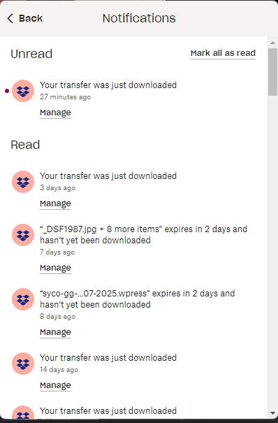
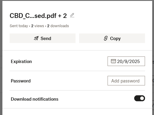
Do you guys have any clue what transfers are downloaded without clicking on the little button "Manage"? You are viewing notification on the app, but clicking on manage will get you to the browser and look below, Dropbox doesn't have enough room to show the full name of the transfer?
I would like to fire the Dropbox UX guy and give him/her 100 lashes for this odd UX behavior. Is AI the Nonsense doing these?
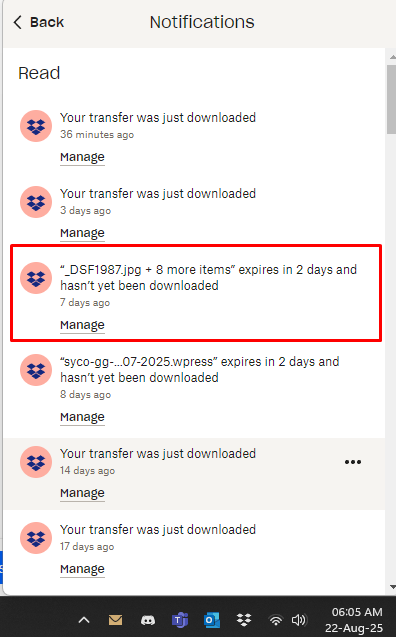
And guess what, they were able to show the name for the Transfers that are being expired. Amazing, right? But couldn't show the name of the Transfers those are downloaded which has more importance sometimes.
Any Dropbox UX person out their to explain the situation. And I'm sorry how I wrote this up, but I've been using Dropbox for over a decade and I'm tired of this and finally took the time put it here.
NB: I love this forum editor. It's the best among others I've used for a while.
Thank you!